SBK Visual Identity Guidelines
Visual identity specifications for SBK Consulting brand assets
Generated: January 2026 Updated: February 2026 Status: Active Related: Design System | Brand Voice | Generative Prompts
Design System Variants
SBK Consulting maintains a parameterized design system with eight distinct visual variants. Each variant is fully specified with tokens, components, and motion specifications. This visual identity document shows the default/primary configuration (Trusted Advisor), but alternate variants exist for specific contexts.
Variant Overview
| Variant ID | Name | Visual Character | Primary Use Cases |
|---|---|---|---|
trusted_advisor |
Trusted Advisor (Default) | Clean authority with deep blue anchoring | General brand usage, corporate materials, website primary |
modern_partner |
Modern Partner | Warm neutrals with teal accents | Non-profit clients, healthcare, mission-driven content |
bold_challenger |
Bold Challenger | High-contrast charcoal with orange | Differentiation campaigns, competitive positioning |
cyber_shield |
Cyber Shield | Dark mode with threat red accents | Security services, threat protection, SOC content |
sentinel_guard |
Sentinel Guard | Dark purple/violet gradients | AI-powered security, autonomous protection messaging |
clean_developer |
Clean Developer | Pristine white with indigo/violet | Developer documentation, technical content, API docs |
creative_clay |
Creative Clay | Bold asymmetric with organic shapes | Marketing campaigns, creative content, unique expressions |
blueprint_technical |
Blueprint Technical | Engineering drawing aesthetic | Technical diagrams, architecture documentation, schematics |
Variant Descriptions
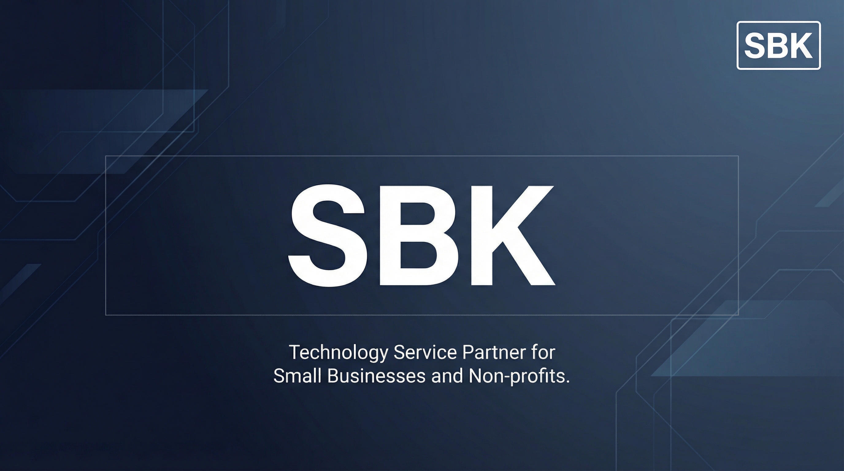
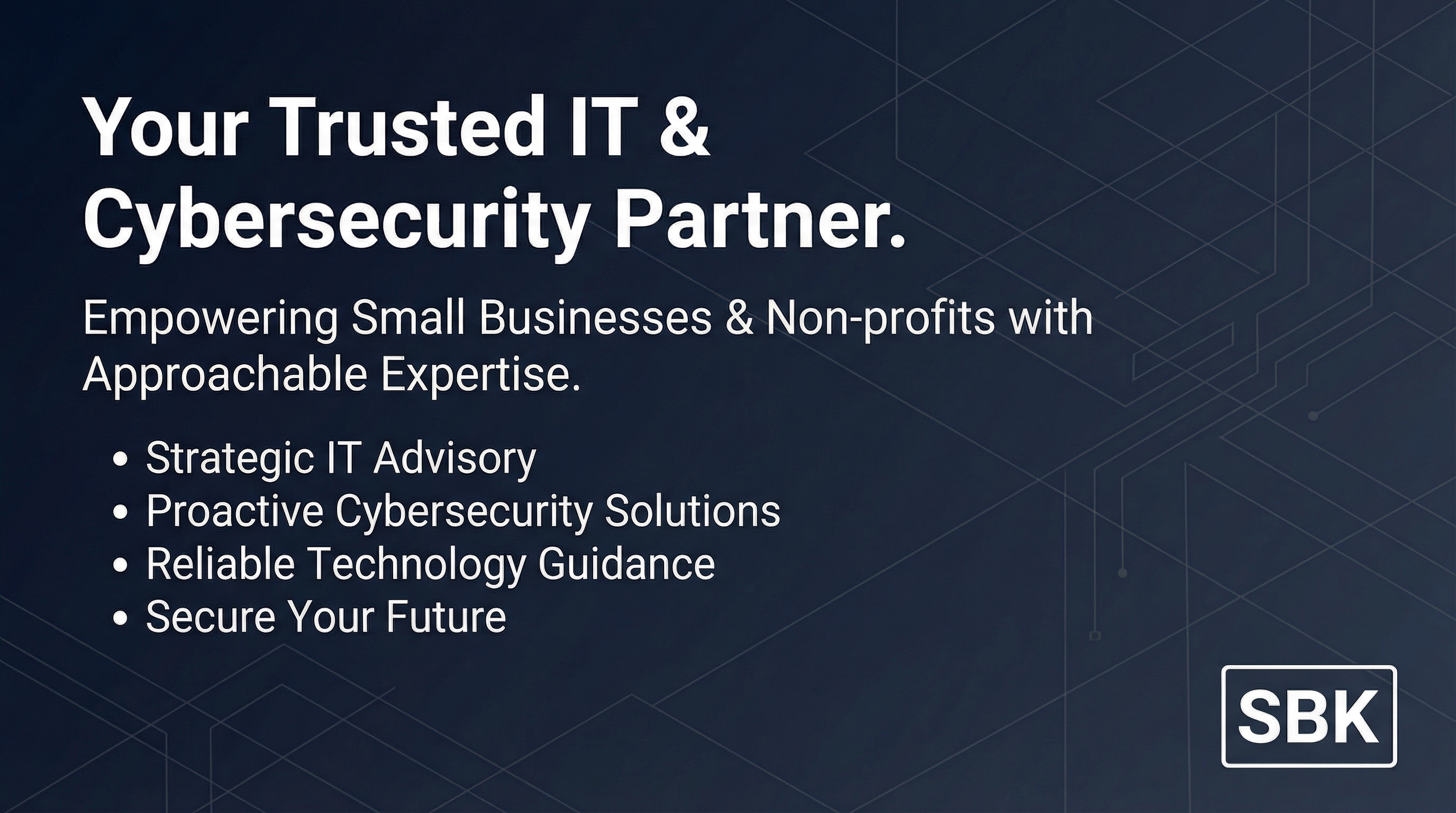
Trusted Advisor (Variant A - Default) Professional stability for established client relationships. Swiss International design language meets professional services. Clean, reliable, sophisticated. This is the primary brand expression used across most touchpoints.
Modern Partner (Variant B) Collaborative warmth for progressive partnerships. Humanist modern aesthetic with warm cream backgrounds and teal accents. Best for mission-driven organizations, healthcare clients, and content emphasizing partnership values.
Bold Challenger (Variant C) Confident disruption for differentiation. High-contrast charcoal with burnt orange accents. Sharp edges, bold typography, memorable visual impact. Use when positioning against competitors or making strong market statements.
Cyber Shield (CrowdStrike-inspired) Security operations aesthetic for threat protection content. Always dark mode with threat red accents, scan line textures, and technical grid overlays. Command center density, corner brackets. Use for security service pages, SOC documentation, threat intelligence content.
Sentinel Guard (SentinelOne-inspired) AI-powered defense aesthetic for autonomous protection messaging. Dark mode with purple-to-violet gradients, neural network textures, flowing data visualizations. Use for AI/ML security content, automated threat response, intelligent defense messaging.
Clean Developer (Stripe-inspired) Developer-focused clarity for technical excellence. Pristine white backgrounds, indigo/violet color system, generous whitespace, prominent code typography. Use for API documentation, developer guides, technical integrations.
Creative Clay (Clay-inspired) Distinctive creativity for memorable brand moments. Bold asymmetric layouts, organic blob shapes, oversized typography, section contrast alternation. Use for marketing campaigns, creative showcases, content requiring visual distinction.
Blueprint Technical (AlignUI/Engineering-inspired) Engineering drawing aesthetic for technical precision. Dotted/dashed grid lines, corner marks, technical annotations, measurement indicators. Use for architecture diagrams, system schematics, engineering documentation.
Variant Selection Guide
| Content Type | Recommended Variant |
|---|---|
| Corporate website | trusted_advisor |
| Security services | cyber_shield or sentinel_guard |
| Developer documentation | clean_developer |
| Healthcare clients | modern_partner |
| Marketing campaigns | creative_clay or bold_challenger |
| Technical diagrams | blueprint_technical |
| Sales presentations | bold_challenger or trusted_advisor |
| Compliance content | trusted_advisor |
Full Specifications: See Design System for complete token definitions, component variants, and implementation details.
Generative Prompts: See Generative Prompts Framework for parameterized token system and AI asset generation guidelines.
Logo Specifications
Note: Logo specifications below show the default/primary configuration. Variants may apply different color treatments as specified in the Design System.
Primary Logo
┌─────────────────────────────────────────────────────────────────┐
│                                                                 │
│    ███████╗██████╗ ██╗  ██╗                                     │
│    ██╔════╝██╔══██╗██║ ██╔╝                                     │
│    ███████╗██████╔╝█████╔╝                                      │
│    ╚════██║██╔══██╗██╔═██╗                                      │
│    ███████║██████╔╝██║  ██╗                                     │
│    ╚══════╝╚═════╝ ╚═╝  ╚═╝                                     │
│                                                                 │
│    C O N S U L T I N G                                          │
│                                                                 │
└─────────────────────────────────────────────────────────────────┘
Logo Variants
| Variant | Use Case | File Format |
|---|---|---|
| Primary (Full) | Website header, documents, presentations | SVG, PNG |
| Horizontal | Email signatures, narrow spaces | SVG, PNG |
| Icon Only | Favicon, app icon, social avatars | SVG, PNG, ICO |
| Monochrome | Single-color applications | SVG |
| Reversed | Dark backgrounds | SVG, PNG |
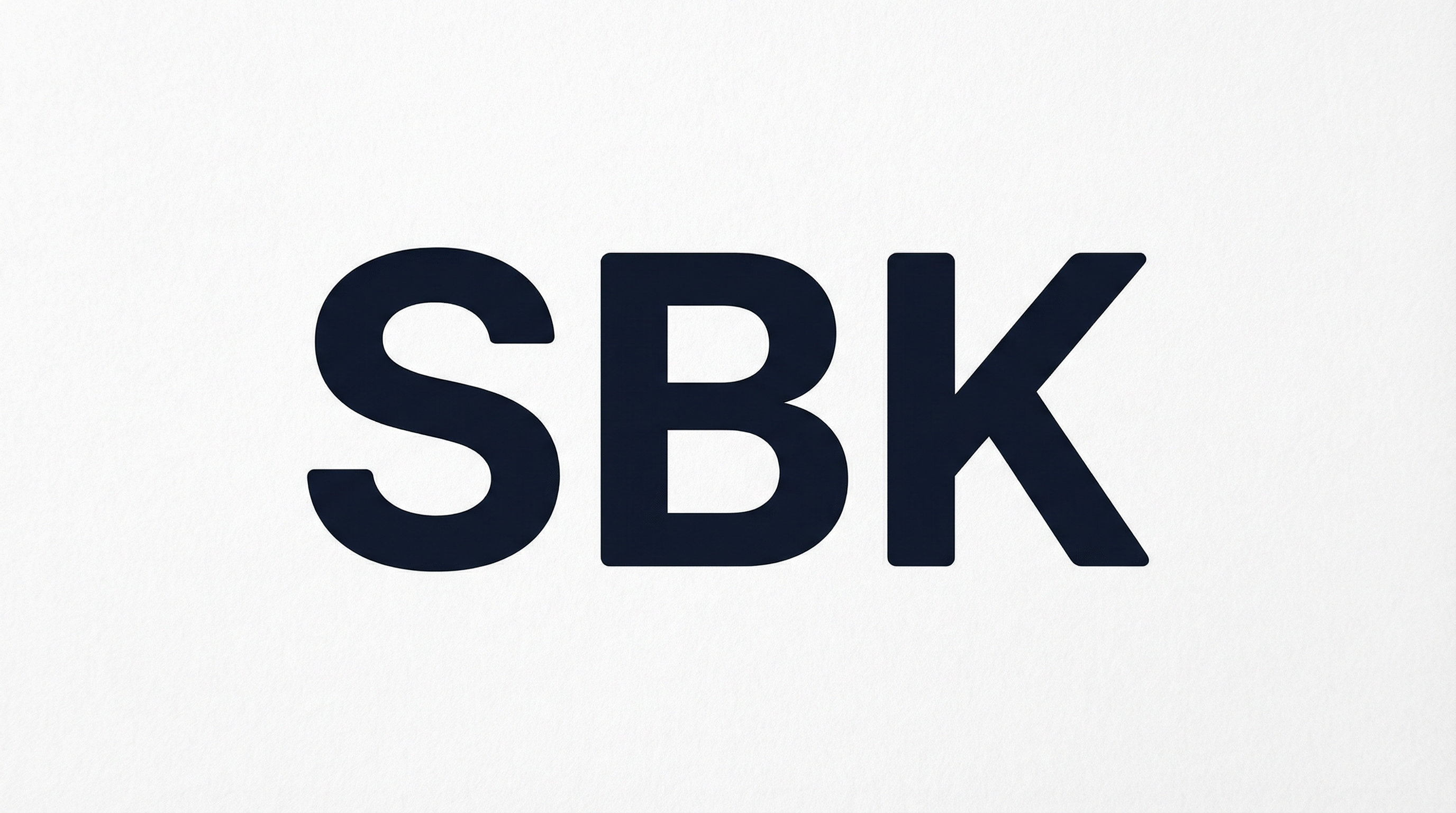
Generated Logo Assets (Trusted Advisor)
| Icon Only | White on Navy | Monochrome Light | Monochrome Dark |
|---|---|---|---|
 |
 |
 |
 |
Official Logos
| SBK Wordmark (White on Navy) | Black Monochrome | Black Monochrome + Consulting |
|---|---|---|
 |
 |
 |
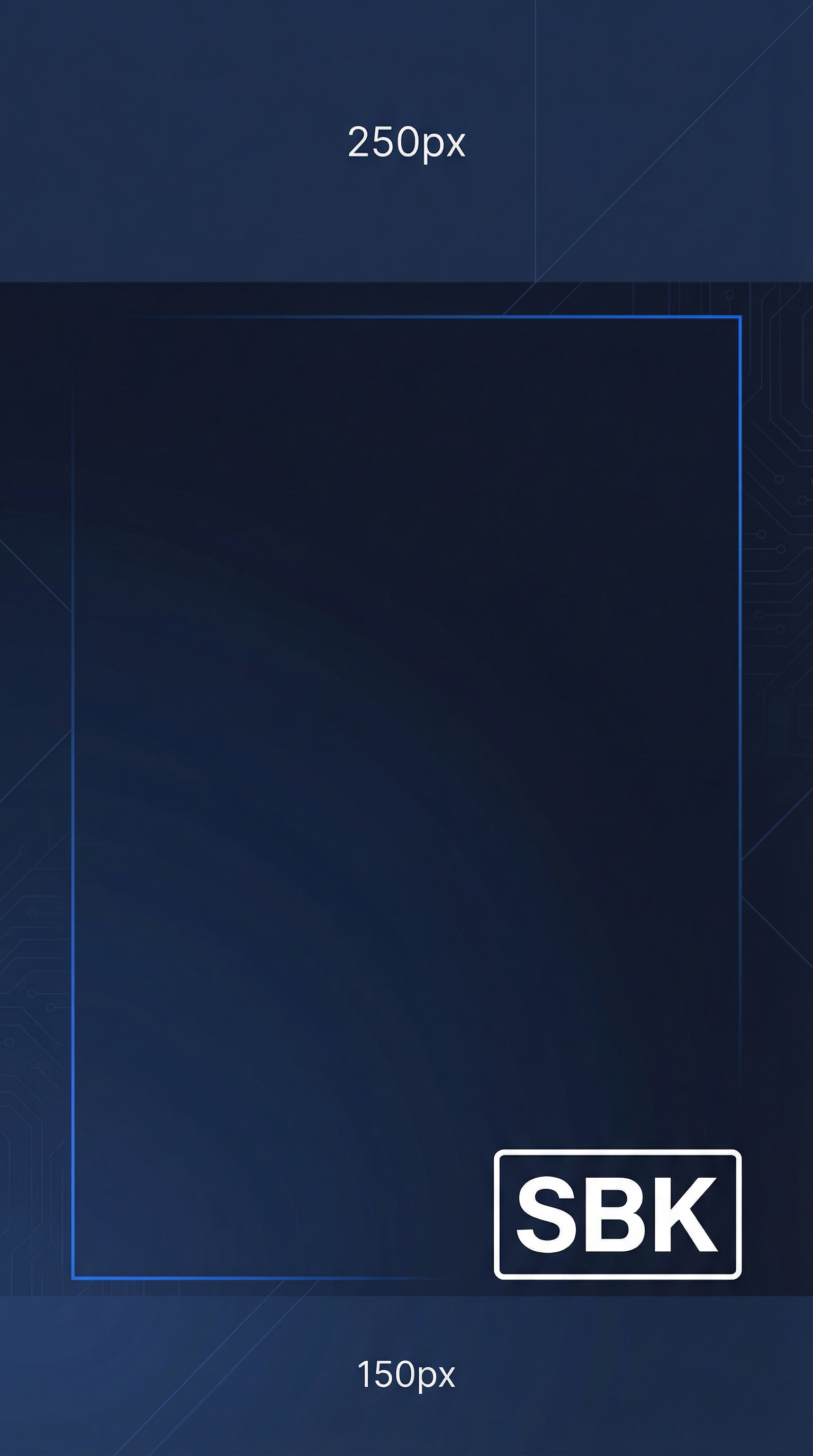
Clear Space
┌─────────────────────────────────────────────────────────────────┐
│                                                                 │
│    ┌───┐                                                        │
│    │ X │  ← Minimum clear space = height of "S" in logo         │
│    └───┘                                                        │
│         ┌─────────────────────────────┐                         │
│    X    │         SBK                 │    X                    │
│         │      CONSULTING             │                         │
│         └─────────────────────────────┘                         │
│                        X                                        │
│                                                                 │
│    No other elements within this protected zone                 │
│                                                                 │
└─────────────────────────────────────────────────────────────────┘
Minimum Sizes
| Application | Minimum Width | Minimum Height |
|---|---|---|
| 1.5 inches | 0.5 inches | |
| Digital | 120px | 40px |
| Favicon | 32px | 32px |
| Social Icon | 48px | 48px |
Color Usage
Note: Color specifications below show the default/primary configuration (Trusted Advisor). Each design system variant has its own complete color palette. See Design System for variant-specific colors and Generative Prompts for token definitions.
Primary Palette (Default: Trusted Advisor)
| Color | Hex | RGB | Usage |
|---|---|---|---|
| SBK Blue | #2563eb |
37, 99, 235 |
Primary brand color, CTAs, links |
| SBK Navy | #0f172a |
15, 23, 42 |
Deep accent, headers, emphasis |
| SBK Charcoal | #0f172a |
15, 23, 42 |
Body text, primary foreground |
| SBK Slate | #64748b |
100, 116, 139 |
Secondary text, captions |
| SBK Light | #f8fafc |
248, 250, 252 |
Backgrounds, cards |
| SBK White | #ffffff |
255, 255, 255 |
Primary background |
Accent Colors
| Color | Hex | Purpose |
|---|---|---|
| Success Green | #10b981 |
Positive actions, confirmations |
| Warning Amber | #f59e0b |
Cautions, attention |
| Error Red | #ef4444 |
Errors, destructive actions |
| Info Blue | #3b82f6 |
Informational, tips |
Color Accessibility
All color combinations must meet WCAG 2.1 AA standards:
| Foreground | Background | Contrast Ratio | Status |
|---|---|---|---|
| SBK Charcoal | SBK White | 16.74:1 | AAA ✓ |
| SBK Blue | SBK White | 4.56:1 | AA ✓ |
| SBK Navy | SBK White | 9.12:1 | AAA ✓ |
| SBK White | SBK Blue | 4.56:1 | AA ✓ |
| SBK White | SBK Navy | 9.12:1 | AAA ✓ |
Typography
Note: Typography specifications below show the default/primary configuration. Variants may use different font stacks, weights, and scales. See Design System for variant-specific typography.
Font Stack (Default Configuration)
| Role | Primary Font | Fallback Stack |
|---|---|---|
| Headlines | Inter (600-700) | SF Pro Display, -apple-system, sans-serif |
| Body | Inter (400-500) | SF Pro Text, -apple-system, sans-serif |
| Mono/Code | JetBrains Mono | SF Mono, Consolas, monospace |
Type Scale
| Level | Size | Weight | Line Height | Usage |
|---|---|---|---|---|
| Display | 60px / 3.75rem | 700 | 1.1 | Hero headlines |
| H1 | 48px / 3rem | 700 | 1.2 | Page titles |
| H2 | 36px / 2.25rem | 600 | 1.25 | Section headers |
| H3 | 30px / 1.875rem | 600 | 1.3 | Subsection headers |
| H4 | 24px / 1.5rem | 600 | 1.4 | Card titles |
| H5 | 20px / 1.25rem | 500 | 1.4 | Small headers |
| Body Large | 18px / 1.125rem | 400 | 1.6 | Lead paragraphs |
| Body | 16px / 1rem | 400 | 1.6 | Default body |
| Body Small | 14px / 0.875rem | 400 | 1.5 | Secondary text |
| Caption | 12px / 0.75rem | 400 | 1.4 | Labels, captions |
Typography Do's and Don'ts
Do: - Use Inter for all digital applications - Maintain consistent hierarchy - Ensure readable line lengths (50-75 characters) - Use proper weight contrast for hierarchy
Don't: - Mix font families arbitrarily - Use decorative fonts - Set body text smaller than 14px - Use all-caps for long passages
Iconography
Icon Style
| Attribute | Specification |
|---|---|
| Style | Outlined, minimal |
| Stroke Width | 1.5px - 2px |
| Corner Radius | Slightly rounded (2px) |
| Sizing | 16px, 20px, 24px, 32px grid |
| Color | Inherit from context |
Icon Libraries (Recommended)
- Lucide Icons (Primary) - Clean, consistent, open source
- Heroicons (Alternative) - Well-designed, Tailwind-native
- Custom - For brand-specific icons only
Service Pillar Icons
| Pillar | Icon Concept | Description |
|---|---|---|
| Protect | Shield with checkmark | Security & compliance |
| Plan | Compass or roadmap | Strategic advisory |
| Operate | Gear with pulse | Managed services |
| Innovate | Lightbulb with arrow | Digital transformation |
Generated Service Pillar Icons (Trusted Advisor)
| Protect | Plan | Operate | Innovate |
|---|---|---|---|
 |
 |
 |
 |
Compliance Icons
| HIPAA | SOC 2 | CMMC |
|---|---|---|
 |
 |
 |
Photography & Imagery
Photography Style
| Attribute | Guideline |
|---|---|
| Subject | Real people, authentic workplace settings |
| Lighting | Natural, clean, professional |
| Color Treatment | Warm neutrals, slight desaturation |
| Composition | Clean backgrounds, focus on subject |
| Avoid | Stock clichés, overly staged, handshake photos |
Image Categories
| Category | Purpose | Examples |
|---|---|---|
| Team/People | About page, testimonials | Natural office settings |
| Abstract/Tech | Backgrounds, headers | Subtle patterns, data viz |
| Illustration | Explanatory, features | Minimal, flat style |
| Screenshots | Product demos, features | Clean, annotated |
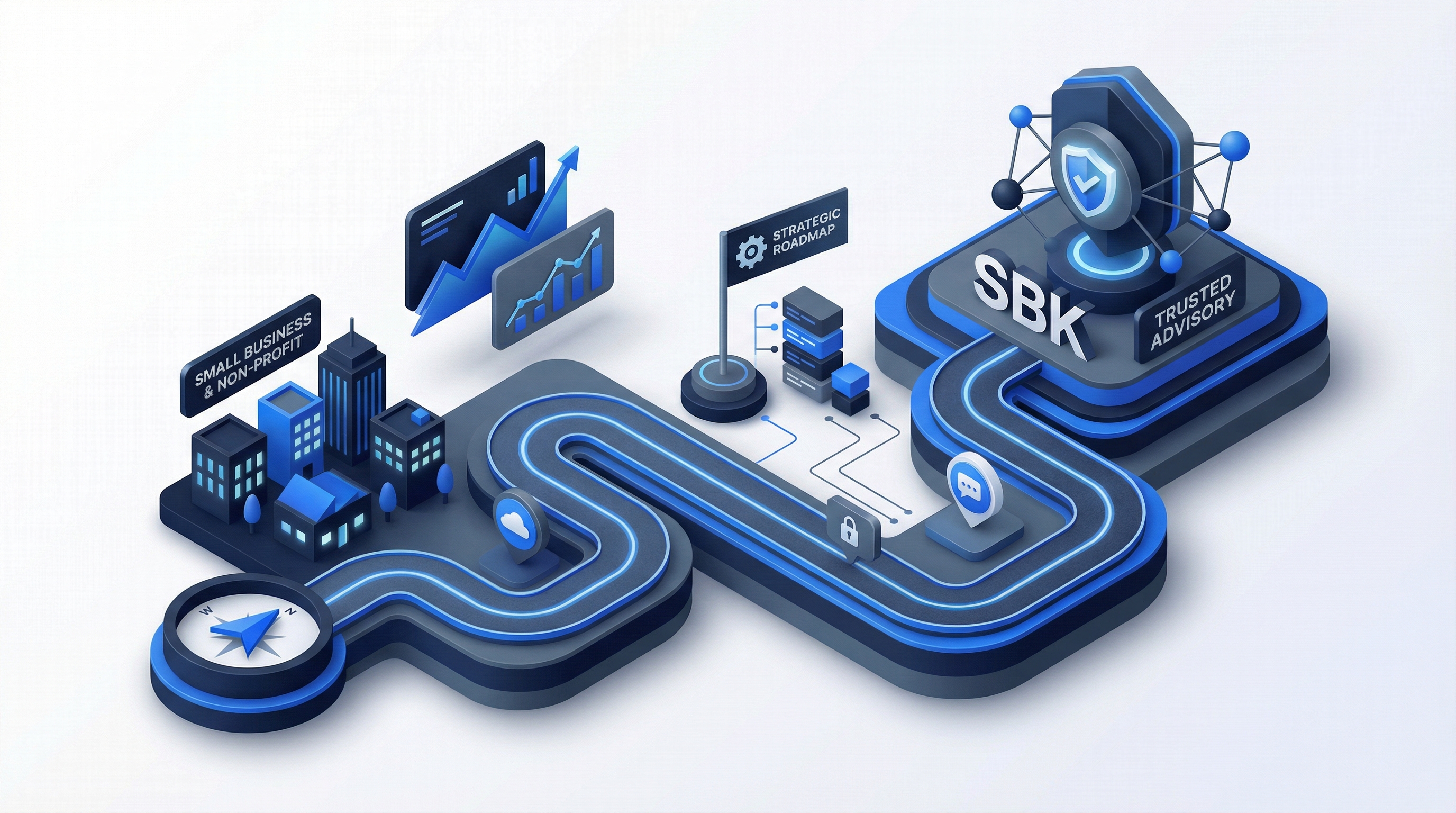
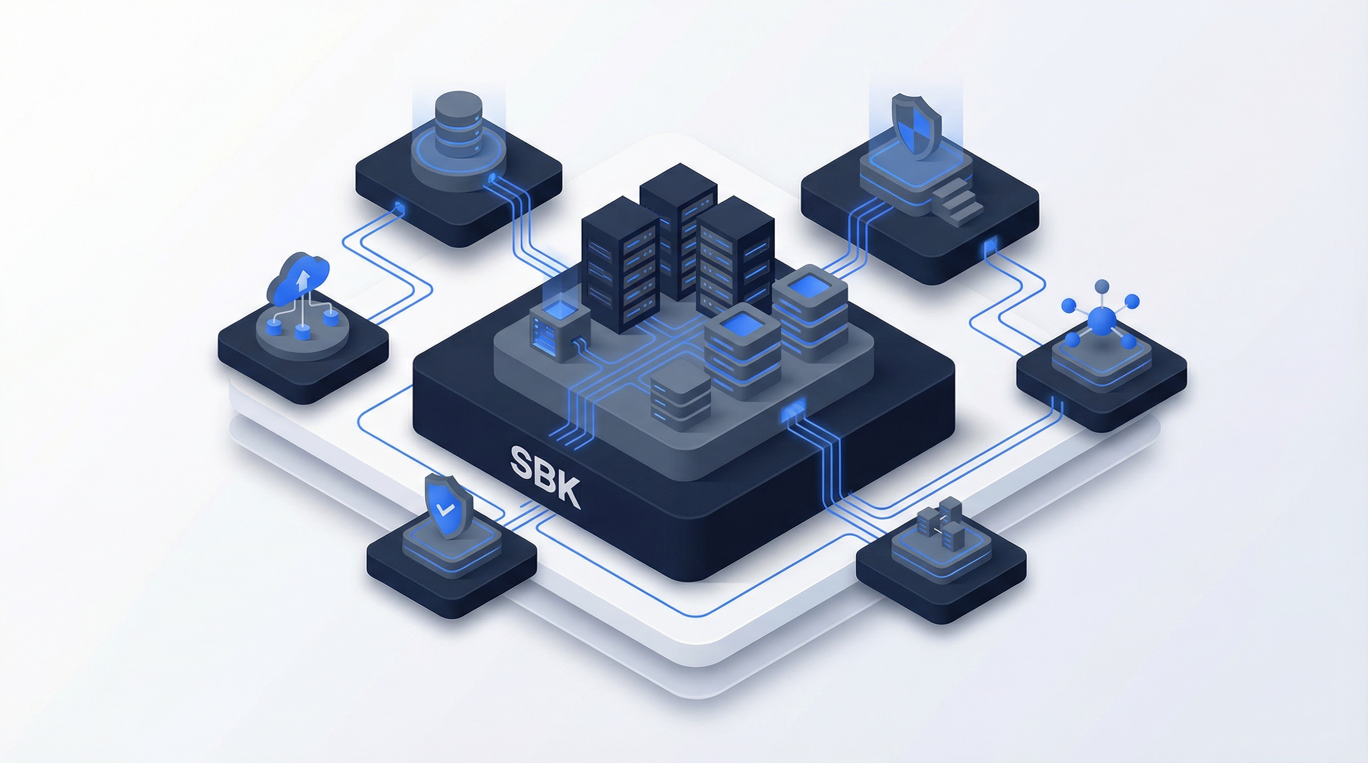
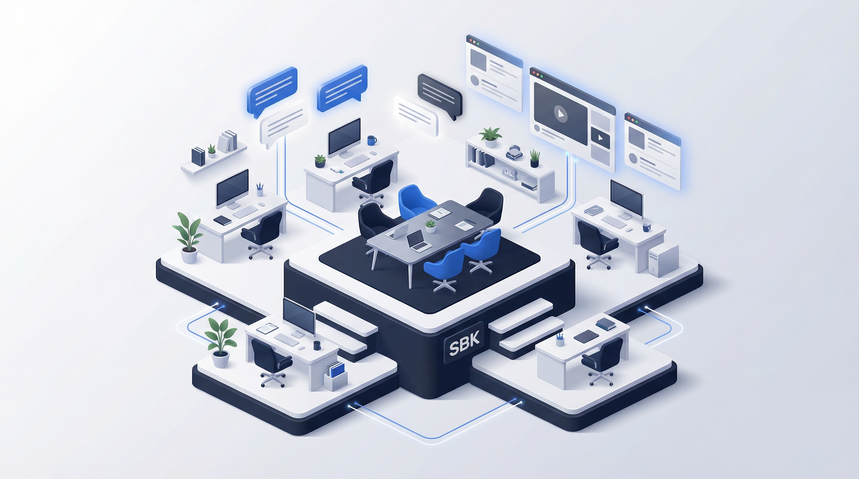
Generated Illustrations (Trusted Advisor)
| Security | Strategy | Cloud | Team |
|---|---|---|---|
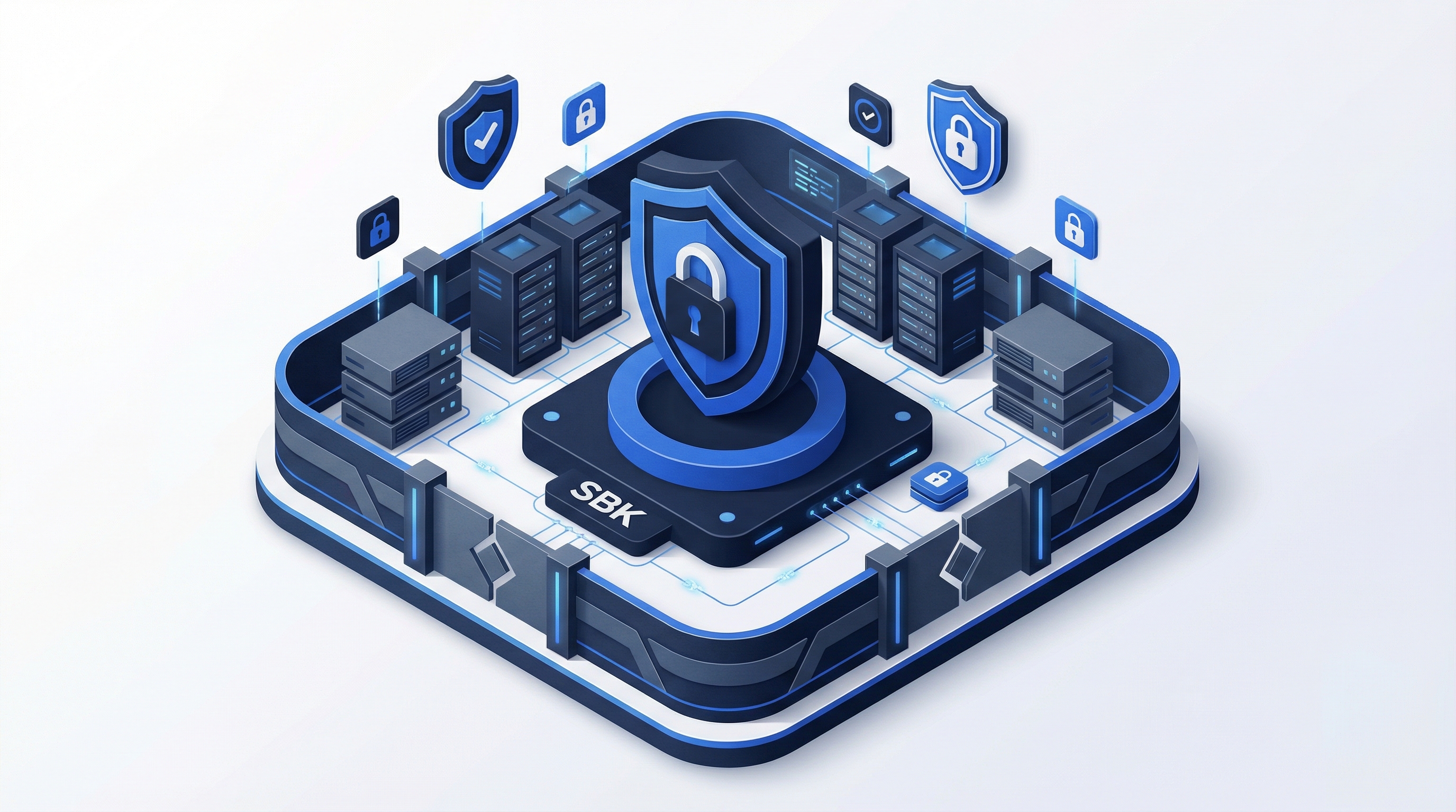 |
 |
 |
 |
Generated Social Assets (Trusted Advisor)
Profile & Banner Images
| LinkedIn Banner | LinkedIn Profile |
|---|---|
 |
 |
| Twitter Header | YouTube Banner |
|---|---|
 |
 |
Post Templates
| LinkedIn Post | Instagram Square | Twitter Post | Story Template |
|---|---|---|---|
 |
 |
 |
 |
Photography Don'ts
- Generic stock handshakes
- Overly diverse but fake-looking group shots
- Cheesy "hacker in hoodie" cybersecurity images
- Complex, busy backgrounds
- Heavy filters or extreme color grading
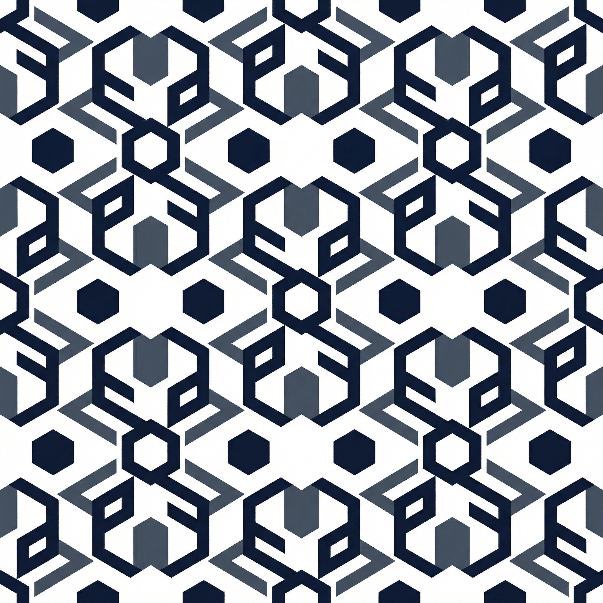
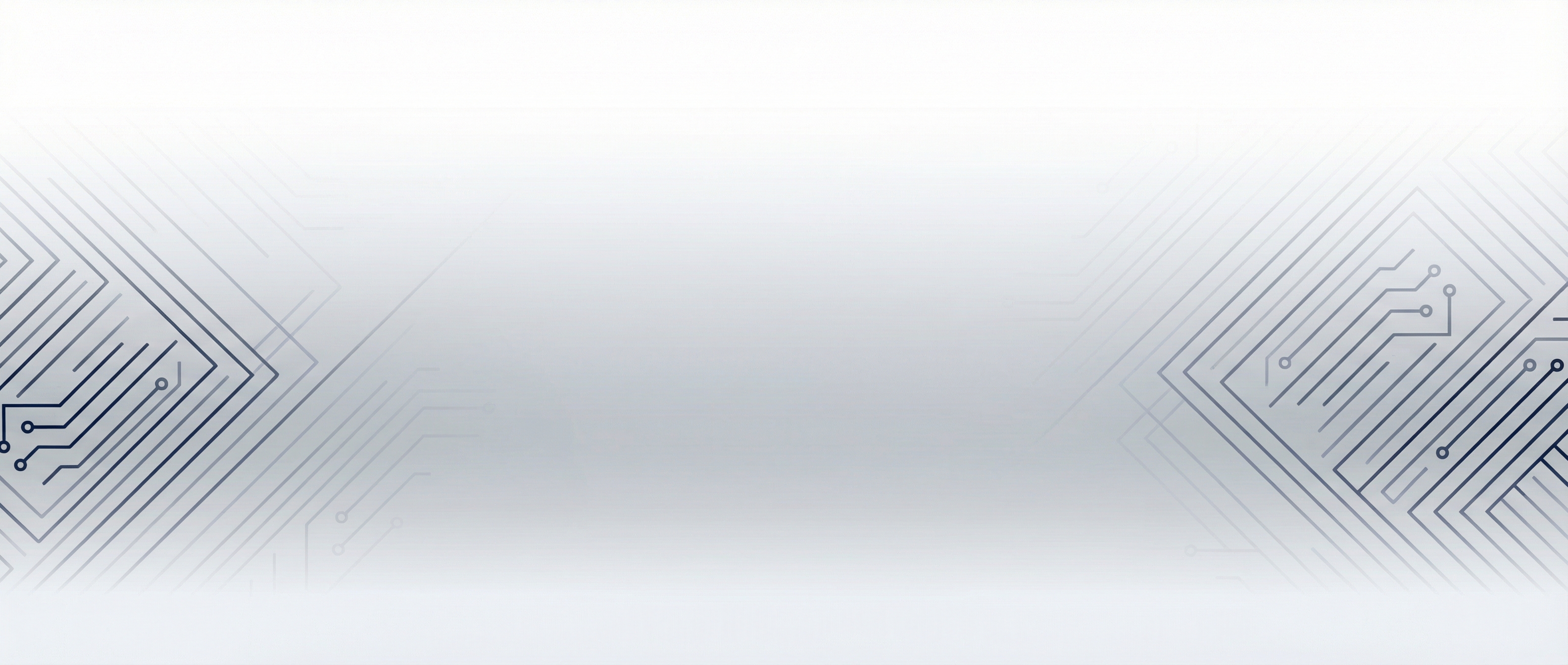
Pattern Library
Note: Pattern specifications below show the default/primary configuration. Each design system variant has specific pattern, texture, and grid preferences. See Generative Prompts for variant-specific grid and frame systems.
Background Patterns (Default Configuration)
patterns:
  grid-subtle:
    type: "grid"
    color: "#f1f5f9"
    size: "40px"
    opacity: 0.5

  dots-light:
    type: "dots"
    color: "#e2e8f0"
    size: "2px"
    spacing: "20px"
    opacity: 0.4

  gradient-hero:
    type: "gradient"
    direction: "180deg"
    stops:
      - "#f8fafc 0%"
      - "#ffffff 100%"

  gradient-section:
    type: "gradient"
    direction: "180deg"
    stops:
      - "#ffffff 0%"
      - "#f8fafc 100%"
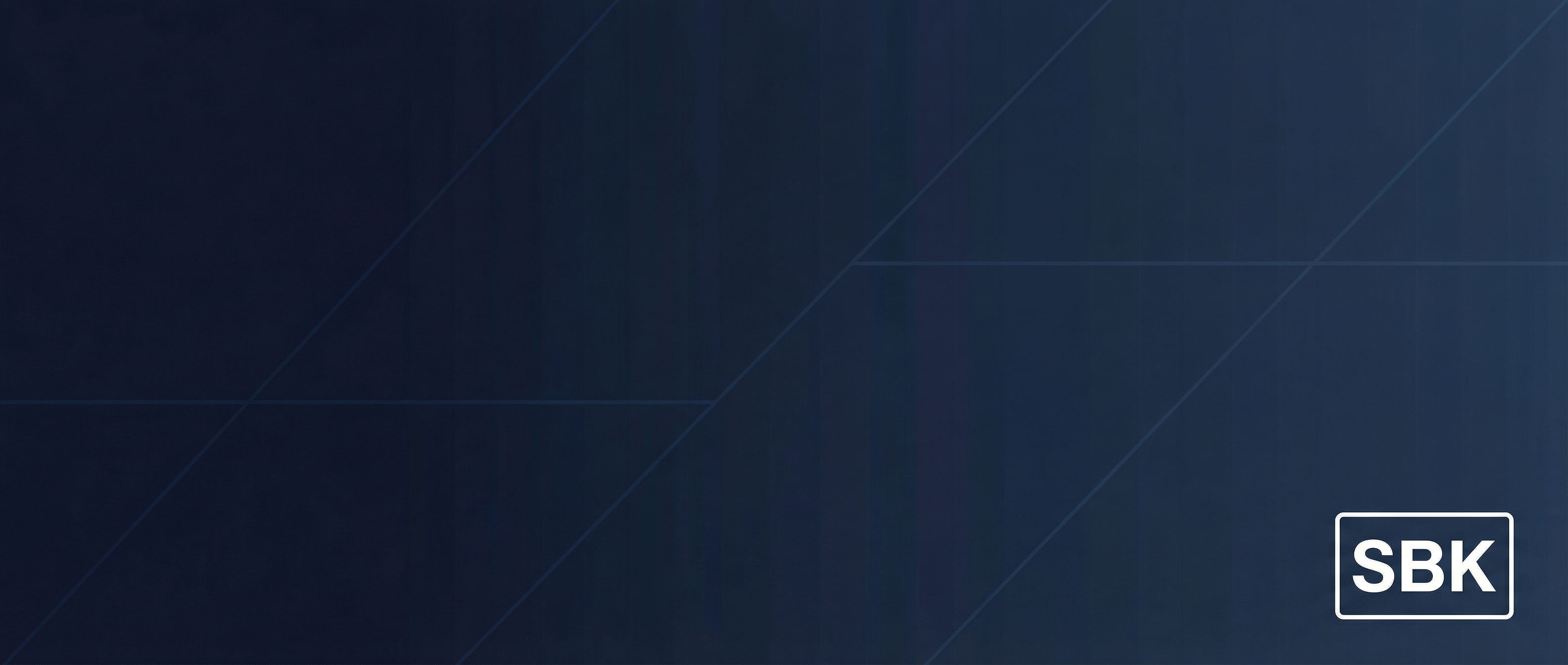
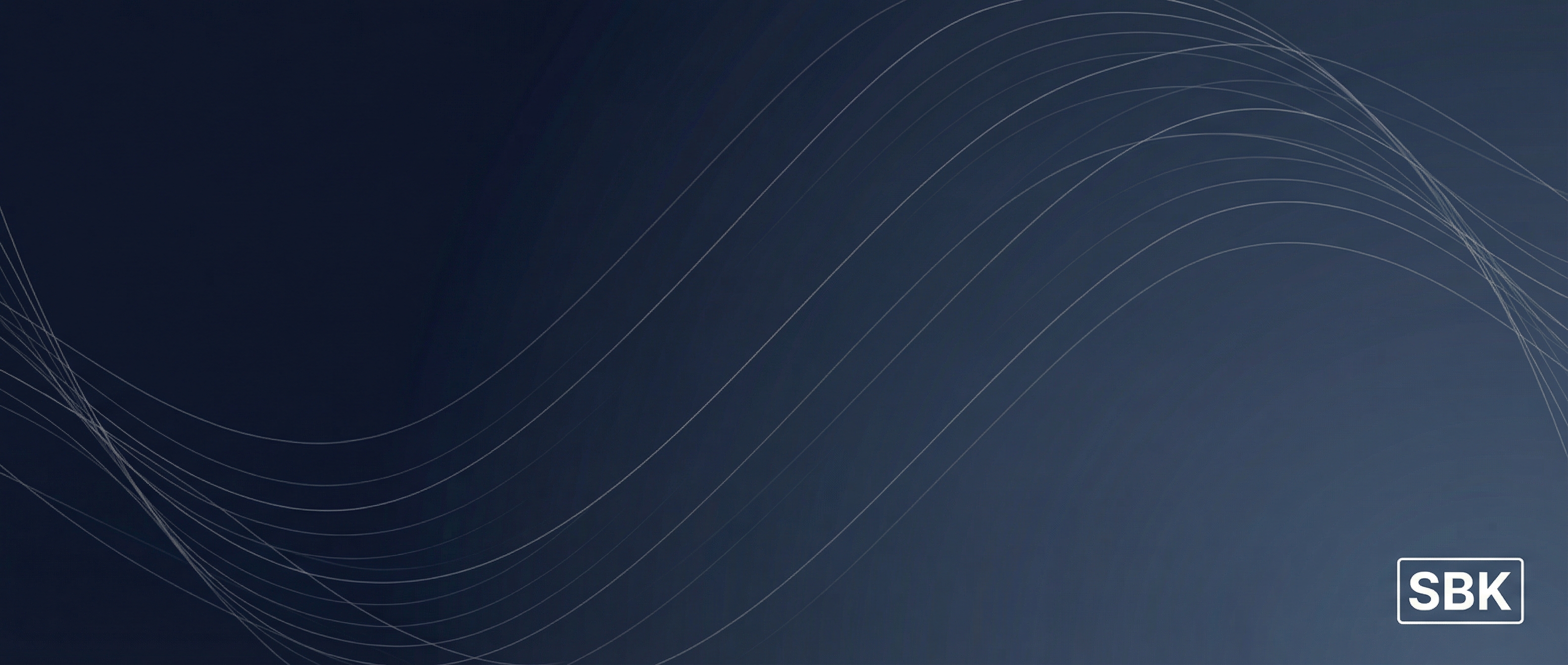
Generated Background Assets (Trusted Advisor)
| Geometric Lines | Diagonal Subtle | Flowing Lines | Minimal Grid |
|---|---|---|---|
 |
 |
 |
 |
| Pattern Geometric | Pattern Subtle | Section Divider |
|---|---|---|
 |
 |
 |
Decorative Elements
| Element | Usage | Specification |
|---|---|---|
| Divider Line | Section separation | 1px, #e2e8f0 |
| Accent Bar | Emphasis | 4px wide, primary-500 |
| Card Shadow | Elevation | shadow-sm to shadow-lg |
| Border Radius | Softness | 6px standard, 12px large |
Animation & Motion
Note: Motion specifications below show the default/primary configuration. Each design system variant has specific animation characteristics (e.g., cyber variants use crisper, more intentional motion). See Design System for variant-specific motion tokens.
Motion Principles
- Purposeful: Every animation should have a reason
- Subtle: Enhance, don't distract
- Fast: 150-400ms for most interactions
- Accessible: Respect
prefers-reduced-motion
Standard Transitions
| Element | Duration | Easing | Property |
|---|---|---|---|
| Button Hover | 150ms | ease-out | background-color, transform |
| Card Hover | 200ms | ease-out | box-shadow, transform |
| Modal Open | 250ms | ease-out | opacity, transform |
| Page Transition | 400ms | ease-in-out | opacity |
| Scroll Reveal | 600ms | ease-out | opacity, transform |
Micro-interactions
/* Button Hover */
.btn:hover {
  transform: translateY(-1px);
  transition: all 150ms ease-out;
}

/* Card Hover */
.card:hover {
  box-shadow: 0 10px 15px -3px rgb(0 0 0 / 0.1);
  transform: translateY(-2px);
  transition: all 200ms ease-out;
}

/* Link Underline */
.link:hover {
  text-decoration-color: currentColor;
  transition: text-decoration-color 150ms ease-out;
}
Application Examples
┌─────────────────────────────────────────────────────────────────┐ │ │ │ [SBK LOGO] Services Why SBK Industries Resources │ │ [Contact →] │ │ │ │ bg: white | text: charcoal | cta: blue | height: 72px │ │ │ └─────────────────────────────────────────────────────────────────┘
┌─────────────────────────────────────────────────────────────────┐
│                                                                 │
│  [Name]                                                         │
│  [Title] | SBK Consulting                                       │
│                                                                 │
│  📧 email@sbkconsulting.com                                     │
│  📱 (555) 123-4567                                              │
│                                                                 │
│  ─────────────────────────────────────                          │
│  Zero vendor conflicts since 2010.                              │
│  sbkconsulting.com                                              │
│                                                                 │
└─────────────────────────────────────────────────────────────────┘
Business Card
┌───────────────────────────────────┐
│                                   │
│  [SBK LOGO]                       │
│                                   │
│  Name Surname                     │
│  Title                            │
│                                   │
│  email@sbkconsulting.com          │
│  (555) 123-4567                   │
│                                   │
│  sbkconsulting.com                │
│                                   │
├───────────────────────────────────┤
│  bg: white | accent bar: blue     │
└───────────────────────────────────┘
File Organization
Asset Directory Structure
/brand-assets/
├── logos/
│   ├── primary/
│   │   ├── sbk-logo-full.svg
│   │   ├── sbk-logo-full.png
│   │   └── sbk-logo-full@2x.png
│   ├── horizontal/
│   ├── icon/
│   ├── monochrome/
│   └── reversed/
├── colors/
│   ├── palette.ase         # Adobe Swatch
│   ├── palette.sketchpalette
│   └── palette.json
├── typography/
│   ├── Inter/
│   └── JetBrains-Mono/
├── icons/
│   ├── service-pillars/
│   └── ui-icons/
├── patterns/
│   ├── backgrounds/
│   └── decorative/
└── templates/
    ├── presentations/
    ├── documents/
    └── social/
Brand Misuse
Logo Don'ts
- Don't stretch or distort
- Don't rotate
- Don't change colors arbitrarily
- Don't add effects (shadows, glows, gradients)
- Don't place on busy backgrounds
- Don't outline or stroke
- Don't use low-resolution versions
Color Don'ts
- Don't use unapproved color combinations
- Don't use low-contrast text
- Don't override accessibility requirements
- Don't use gradients not specified in guidelines
Typography Don'ts
- Don't substitute fonts without approval
- Don't use decorative or script fonts
- Don't stretch or compress type
- Don't use poor kerning or tracking
Related Documents
Core Brand References
- Design System - Full token specifications for all 8 design system variants
- Brand Voice - Messaging and copy guidelines
- Pricing & Positioning - Market positioning
Generative Asset System
- Generative Prompts Framework - Parameterized token system for AI asset generation
- Global Design Tokens - Color primitives, typography, spacing scales
- Variant Configurations - Complete variant specifications with prompt prefixes
- Grid & Frame Systems - Layout structure options by variant
Asset Generation Resources
- Logo Prompts - Primary logo and variant generation
- Background Prompts - Hero sections, slides, documents
- Pattern Prompts - Repeating textures, decorative elements
- Diagram Prompts - Process flows, architecture, infographics
Last Updated: February 2026 Version: 1.1